Sunday, September 20, 2015

Christmas Preview


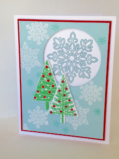
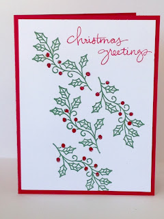
Yes, we hate it when retailers put out Christmas trees right next to the Halloween decorations; but if you want to send home-made Christmas Cards in December and keep your sanity, now is the time to plan ahead.  Breaking up this task into small manageable bits will make it actually enjoyable and easy.

Here are four ideas for you, all from the new 2015 Holiday Mini catalog.
I am heavy in the middle of rehearsals for Pirates of Penzance, so forgive me for not putting all the details right now--I will try to add them after the 5th of October.


Sunday, September 13, 2015

Vintage Leaves

A simple, pretty card for autumn featuring Vintage Leaves, Acorny Thank You and Into the Woods DSP.  Perfect for Thanksgiving, friendship or any occasion.


The leaf is stamped with Cajun Craze ink, and colored with Daffodil Delight marker.

Now, I know that the yellow on the leaf looks more like one of the other yellows, but no!  Because I colored over the Cajun Craze ink, which is water based, the colors blended a little to give me this lovely soft autumn yellow.

To achieve this look, start coloring in the more open parts of the image, stroking inward in one direction so that the colors don't smear too much.  As you go over the russet color of the leaf, your yellow marker will pick up a little of that ink, and give you a softer, darker yellow as you go.  As you color over the denser part of the image, it will give you a lovely bright orange.  I also brightened it further with a little Pumpkin Pie marker here and there.

The body of the acorn is Soft Suede, and the cap is Early Espresso.  Stamp the body, then punch the acorn shape out with the Acorn Builder Punch, then just stamp the cap at the top of the punched shape.  It is pretty easy with the see-through polymer stamps!  The acorn is popped up on dimensionals.

The beautiful ribbon is available on clearance while supplies last at an amazing 60% off.
Here is the complete supplies list, with bundles listed where available:


Sunday, August 23, 2015

Holiday Mini Preview--Lighthearted Leaves

Coming soon* to a Holiday Mini catalog near you, this wonderful new set makes the most elegant cards, with the look of fine batik or an expensive silk dress; but stamp several different leaves on a plain white card, and you get fun, loose the look of doodles done by a student not paying attention in class.  (*This set and many others will be available for purchase beginning Sept 1st.)
 

The Into the Woods DSP has two choices of wooden background, but here I have chosen to use
the Woodgrain Embossing Folder to get 3-D grain.  I rolled Early Espresso ink on the inside front of the folder with my brayer,  and used Crumbcake Cardstock to get a beautiful two-tone effect.

I used a bit of the Burlap Ribbon for some more rustic texture, and pulled a few threads out of each end to fray it just a little.

I stamped the largest leaf three times in Versamark onto a piece of Very Vanilla Cardstock, and embossed with a soft-white embossing powder.  The leaves were sponged in Pear Pizzazz and Soft Sky, and the spaces in between softened with Sahara Sand sponging. The small leaf popped up in front was likewise heat embossed, and sponged with Cajun Craze and Pear Pizzazz.  The banner is Cajun Craze on Very Vanilla Cardstock.


Both the banner and the leafy center panel (as well as the Very Vanilla liner on the inside of the card) were edged with Early Espresso sponging.


The front leaf was cut out with the Leaflets framelits, which fit Lighthearted Leaves as well as the Vintage Leaves set, which they were originally introduced with in this year's catalog.


The center panel was layered on Mossy Meadow cardstock, and popped up on dimensionals.  The banner was snail-taped flat, and the small leaf popped up again.  Because the end of the leaf hangs off of the center, I used one dimensional on the tip and bottom right curve of the leaf, and layered two (one atop the other) in the left curve, and two little slivers of dimensional on the stem.  I hate leaving stems dangling; I'm always afraid they'll get torn off.  Luckily, you can cut your dimensional to shape as you like. 


We had lots of fun with this design at my card class this weekend--each person made a different spectrum of colors; most adding a little or a lot of Cajun Craze to the center panel; one omitting the Sahara Sand to keep the center panel brighter.  All the variations looked great.  I don't think it's possible to make a mistake with this card!

Supplies list below.

Into the Woods with a Watercolor Butterfly

The soon-to-arrive Into The Woods DSP (available beginning September 1st) is a great collection of bright fall bouquets, flowering vines and leaves, along with two wood grain backgrounds and plenty of acorns.  Here is just a tiny sliver of one of the vine designs:


I saw a version of this card on splitcoast stampers, and loved the color combo on the butterfly.  Making a few changes, I used the Into the Woods DSP, together with a pattern from my stash on top.
The gorgeous Mellow Moss stitched satin ribbon is still available ON SALE at 60% OFF in the clearance rack.  This style is so pretty, I can't believe what a great deal it is, but it's only while supplies last.

The butterfly is the larger image set from Watercolor Wings.  I used Tempting Turquoise, Calypso Coral, and Daffodil Delight for the wings, and Old Olive for the body.  If you look closely, however, you'll notice that there is some bright green in the butterfly's wings as well.  This is because the yellow overlaps the blue.

To get this effect, ink up the large "flat" wing image with Daffodil Delight.  Take a damp Q-tip and wipe a little ink off just the edges before stamping.  Otherwise, the edges of the wings will be all green.

You may stamp any of the stamps first, it doesn't really matter; but I found it easiest to line them up when I started with the darker colors.


I added a bit of Tangerine Tango ribbon to give a little splash of color in balance to the butterfly.  Wait--yes, the butterfly was done in Calypso Coral, which is a bit redder, but with the Daffodil Delight added on top, it brightened the orange enough to where it didn't match the Calypso Coral ribbons, so I went a shade brighter.

I cut the butterfly out using the Big Shot with the Bold Butterflies framelits--the larger one for the stamped image, and the smaller one for the overlay, which is cut out of Old Olive cardstock.

The sentiment is from the Endless Birthday Wishes Stamp Set.


Holiday Mini Preview--Acorny Thank You

I have not had enough time to play with my new toys from the Holiday Mini, but it is full of so many great stamp sets, dies, papers and accessories perfect for fall and winter.  Here is my first new card:
The Holiday Mini items will be available starting September 1st.

 Using the brand new Acorny Thank You set together with the Vintage Leaves new in this year's catalog, I made this fun card for Thanksgiving.

  The colors are Wild Wasabi, Hello Honey and Cajun Craze.  The Cajun Craze polka-dot ribbon is long since retired, but can substitute the Hello Honey washi tape from the Bohemian Designer Washi Tape group if you don't have any other ribbon you like.

  The gold thread is new in the Holiday Catalog--it is called Cording Trim, and is much thicker than the metallic thread in the annual catalog.  It's very nice, and comes in gold and silver.


I used a some gold sequins I had in my stash, and noticed that the tiny centers were in the bag, so I sprinkled a few of those on the card as well, using my "how to glue tiny objects" technique shown in this video (go to 6:25 for the technique.)


The acorn is popped up on dimensionals over the Cajun Craze/Very Vanilla rectangle, and that in turn is popped up as well.  The thread is stuck down with two or three glue dots and wound around in random loops.  The dimensionals also help hold the thread in place. 

Built for Free Using: My Stampin Blog

Saturday, August 1, 2015

A Summer Bouquet


The Sprinkles of Life stamp set is hugely versatile, and has so many possibilities!  Today I have used the flower bunch and the cupcake bottom stamps to make a basket of flowers.  The mojo sketch seems to have taken up residence in my brain, because when I thought of making a basket of flowers, I immediately pictured it in this layout, which is just a slight variation of this week's Mojo.
www.mojomonday.com


Even tho' it's a "tall" sketch, I made the card to the standard A2 measures. 

I wanted to use my Two-Tone Trim in Tangerine Tango and Whisper White for the handle of the basket.
I love the orange for a bright, summery color, but the heat we've been having lately has made me in the mood for cool tones--thus the Pool Party and Lost Lagoon.

Of course, orange and blue are complimentary colors, so this works quite well.  I like the emphasis the orange makes in the flowers and basket.  The layout spotlights them, but the colors really make them pop. 


I stamped the images in Stazon, trying to keep the outlines of the flowers as light as I could.  I used Pear Pizzazz, Garden Green, Pumpkin Pie, Cherry Cobbler, Real Red and Daffodil delight for the floral arrangement.  I used Tangerine Tango, Pool Party and So Saffron for the basket.

Ok--why not just use all Tangerine Tango? I found that the flowers came out too dark.  The Pumpkin Pie kept them a bit brighter.  Now, these two oranges are not simply a lighter & darker shade of each-other.  The Tang-tang has a lot more red in it.  But, you can cheat a lot when you're dealing with depictions of flowers or plants, and with differences in texture, like paper vs. ribbon.  You might not even have noticed that the color of the flowers doesn't match that of the twine.  I did use Tang-tang ink for the sentiment, but layered it onto a Pumpkin Pie flag.  Again, a lighter color just looked better and more balanced. I can get away with this here, because the two oranges already appear in the design, and the sentiment is in small lettering.  Same with the Garden Green vs. the Pear Pizzazz.  These two greens do not normally match, one being cool and one warm.  However, in a floral arrangement, they play very nicely together.

Friday, July 31, 2015

The Ultimate Color Challenge

Many of you enjoy doing card challenges.  Participants might be given a layout sketch, a theme, or a collection of colors to work from, and they make a card with those elements.  It is great fun seeing what everyone comes up with. 

I  happened to Google "color challenge," and to my delight, I found this fun little test by X-Rite, a color manufacturer.  It is scored from zero to 100, with a LOW score being better than a high score.  I scored 4 on my first try, which maybe should have pleased me, but I had to try again and got a perfect score.  Yeay!

Try for yourself!  Click the link below; post your score in the comments.
Ultimate Color Challenge

http://favbulous.com/wp-content/uploads/2013/12/rainbow02.jpg
image from www.designbloom.com