Sunday, September 20, 2015

Christmas Preview


Yes, we hate it when retailers put out Christmas trees right next to the Halloween decorations; but if you want to send home-made Christmas Cards in December and keep your sanity, now is the time to plan ahead.  Breaking up this task into small manageable bits will make it actually enjoyable and easy.

Here are four ideas for you, all from the new 2015 Holiday Mini catalog.
I am heavy in the middle of rehearsals for Pirates of Penzance, so forgive me for not putting all the details right now--I will try to add them after the 5th of October.


Sunday, September 13, 2015

Vintage Leaves

A simple, pretty card for autumn featuring Vintage Leaves, Acorny Thank You and Into the Woods DSP.  Perfect for Thanksgiving, friendship or any occasion.


The leaf is stamped with Cajun Craze ink, and colored with Daffodil Delight marker.

Now, I know that the yellow on the leaf looks more like one of the other yellows, but no!  Because I colored over the Cajun Craze ink, which is water based, the colors blended a little to give me this lovely soft autumn yellow.

To achieve this look, start coloring in the more open parts of the image, stroking inward in one direction so that the colors don't smear too much.  As you go over the russet color of the leaf, your yellow marker will pick up a little of that ink, and give you a softer, darker yellow as you go.  As you color over the denser part of the image, it will give you a lovely bright orange.  I also brightened it further with a little Pumpkin Pie marker here and there.

The body of the acorn is Soft Suede, and the cap is Early Espresso.  Stamp the body, then punch the acorn shape out with the Acorn Builder Punch, then just stamp the cap at the top of the punched shape.  It is pretty easy with the see-through polymer stamps!  The acorn is popped up on dimensionals.

The beautiful ribbon is available on clearance while supplies last at an amazing 60% off.
Here is the complete supplies list, with bundles listed where available:


Sunday, August 23, 2015

Holiday Mini Preview--Lighthearted Leaves

Coming soon* to a Holiday Mini catalog near you, this wonderful new set makes the most elegant cards, with the look of fine batik or an expensive silk dress; but stamp several different leaves on a plain white card, and you get fun, loose the look of doodles done by a student not paying attention in class.  (*This set and many others will be available for purchase beginning Sept 1st.)
 

The Into the Woods DSP has two choices of wooden background, but here I have chosen to use
the Woodgrain Embossing Folder to get 3-D grain.  I rolled Early Espresso ink on the inside front of the folder with my brayer,  and used Crumbcake Cardstock to get a beautiful two-tone effect.

I used a bit of the Burlap Ribbon for some more rustic texture, and pulled a few threads out of each end to fray it just a little.

I stamped the largest leaf three times in Versamark onto a piece of Very Vanilla Cardstock, and embossed with a soft-white embossing powder.  The leaves were sponged in Pear Pizzazz and Soft Sky, and the spaces in between softened with Sahara Sand sponging. The small leaf popped up in front was likewise heat embossed, and sponged with Cajun Craze and Pear Pizzazz.  The banner is Cajun Craze on Very Vanilla Cardstock.


Both the banner and the leafy center panel (as well as the Very Vanilla liner on the inside of the card) were edged with Early Espresso sponging.


The front leaf was cut out with the Leaflets framelits, which fit Lighthearted Leaves as well as the Vintage Leaves set, which they were originally introduced with in this year's catalog.


The center panel was layered on Mossy Meadow cardstock, and popped up on dimensionals.  The banner was snail-taped flat, and the small leaf popped up again.  Because the end of the leaf hangs off of the center, I used one dimensional on the tip and bottom right curve of the leaf, and layered two (one atop the other) in the left curve, and two little slivers of dimensional on the stem.  I hate leaving stems dangling; I'm always afraid they'll get torn off.  Luckily, you can cut your dimensional to shape as you like. 


We had lots of fun with this design at my card class this weekend--each person made a different spectrum of colors; most adding a little or a lot of Cajun Craze to the center panel; one omitting the Sahara Sand to keep the center panel brighter.  All the variations looked great.  I don't think it's possible to make a mistake with this card!

Supplies list below.

Into the Woods with a Watercolor Butterfly

The soon-to-arrive Into The Woods DSP (available beginning September 1st) is a great collection of bright fall bouquets, flowering vines and leaves, along with two wood grain backgrounds and plenty of acorns.  Here is just a tiny sliver of one of the vine designs:


I saw a version of this card on splitcoast stampers, and loved the color combo on the butterfly.  Making a few changes, I used the Into the Woods DSP, together with a pattern from my stash on top.
The gorgeous Mellow Moss stitched satin ribbon is still available ON SALE at 60% OFF in the clearance rack.  This style is so pretty, I can't believe what a great deal it is, but it's only while supplies last.

The butterfly is the larger image set from Watercolor Wings.  I used Tempting Turquoise, Calypso Coral, and Daffodil Delight for the wings, and Old Olive for the body.  If you look closely, however, you'll notice that there is some bright green in the butterfly's wings as well.  This is because the yellow overlaps the blue.

To get this effect, ink up the large "flat" wing image with Daffodil Delight.  Take a damp Q-tip and wipe a little ink off just the edges before stamping.  Otherwise, the edges of the wings will be all green.

You may stamp any of the stamps first, it doesn't really matter; but I found it easiest to line them up when I started with the darker colors.


I added a bit of Tangerine Tango ribbon to give a little splash of color in balance to the butterfly.  Wait--yes, the butterfly was done in Calypso Coral, which is a bit redder, but with the Daffodil Delight added on top, it brightened the orange enough to where it didn't match the Calypso Coral ribbons, so I went a shade brighter.

I cut the butterfly out using the Big Shot with the Bold Butterflies framelits--the larger one for the stamped image, and the smaller one for the overlay, which is cut out of Old Olive cardstock.

The sentiment is from the Endless Birthday Wishes Stamp Set.


Holiday Mini Preview--Acorny Thank You

I have not had enough time to play with my new toys from the Holiday Mini, but it is full of so many great stamp sets, dies, papers and accessories perfect for fall and winter.  Here is my first new card:
The Holiday Mini items will be available starting September 1st.

 Using the brand new Acorny Thank You set together with the Vintage Leaves new in this year's catalog, I made this fun card for Thanksgiving.

  The colors are Wild Wasabi, Hello Honey and Cajun Craze.  The Cajun Craze polka-dot ribbon is long since retired, but can substitute the Hello Honey washi tape from the Bohemian Designer Washi Tape group if you don't have any other ribbon you like.

  The gold thread is new in the Holiday Catalog--it is called Cording Trim, and is much thicker than the metallic thread in the annual catalog.  It's very nice, and comes in gold and silver.


I used a some gold sequins I had in my stash, and noticed that the tiny centers were in the bag, so I sprinkled a few of those on the card as well, using my "how to glue tiny objects" technique shown in this video (go to 6:25 for the technique.)


The acorn is popped up on dimensionals over the Cajun Craze/Very Vanilla rectangle, and that in turn is popped up as well.  The thread is stuck down with two or three glue dots and wound around in random loops.  The dimensionals also help hold the thread in place. 

Built for Free Using: My Stampin Blog

Saturday, August 1, 2015

A Summer Bouquet


The Sprinkles of Life stamp set is hugely versatile, and has so many possibilities!  Today I have used the flower bunch and the cupcake bottom stamps to make a basket of flowers.  The mojo sketch seems to have taken up residence in my brain, because when I thought of making a basket of flowers, I immediately pictured it in this layout, which is just a slight variation of this week's Mojo.
www.mojomonday.com


Even tho' it's a "tall" sketch, I made the card to the standard A2 measures. 

I wanted to use my Two-Tone Trim in Tangerine Tango and Whisper White for the handle of the basket.
I love the orange for a bright, summery color, but the heat we've been having lately has made me in the mood for cool tones--thus the Pool Party and Lost Lagoon.

Of course, orange and blue are complimentary colors, so this works quite well.  I like the emphasis the orange makes in the flowers and basket.  The layout spotlights them, but the colors really make them pop. 


I stamped the images in Stazon, trying to keep the outlines of the flowers as light as I could.  I used Pear Pizzazz, Garden Green, Pumpkin Pie, Cherry Cobbler, Real Red and Daffodil delight for the floral arrangement.  I used Tangerine Tango, Pool Party and So Saffron for the basket.

Ok--why not just use all Tangerine Tango? I found that the flowers came out too dark.  The Pumpkin Pie kept them a bit brighter.  Now, these two oranges are not simply a lighter & darker shade of each-other.  The Tang-tang has a lot more red in it.  But, you can cheat a lot when you're dealing with depictions of flowers or plants, and with differences in texture, like paper vs. ribbon.  You might not even have noticed that the color of the flowers doesn't match that of the twine.  I did use Tang-tang ink for the sentiment, but layered it onto a Pumpkin Pie flag.  Again, a lighter color just looked better and more balanced. I can get away with this here, because the two oranges already appear in the design, and the sentiment is in small lettering.  Same with the Garden Green vs. the Pear Pizzazz.  These two greens do not normally match, one being cool and one warm.  However, in a floral arrangement, they play very nicely together.

Friday, July 31, 2015

The Ultimate Color Challenge

Many of you enjoy doing card challenges.  Participants might be given a layout sketch, a theme, or a collection of colors to work from, and they make a card with those elements.  It is great fun seeing what everyone comes up with. 

I  happened to Google "color challenge," and to my delight, I found this fun little test by X-Rite, a color manufacturer.  It is scored from zero to 100, with a LOW score being better than a high score.  I scored 4 on my first try, which maybe should have pleased me, but I had to try again and got a perfect score.  Yeay!

Try for yourself!  Click the link below; post your score in the comments.
Ultimate Color Challenge

http://favbulous.com/wp-content/uploads/2013/12/rainbow02.jpg
image from www.designbloom.com


Tuesday, July 28, 2015

Friends in the Garden

Have you seen the English Garden designer series paper yet?  It's so pretty, and the color combinations are super.  I can easily see cards for spring, summer, or fall from the various sheets.

This week's Mojo Monday sketch calls for tall & skinny, and it just so happens that I found a stack of extra-long greeting cards envelopes in a drawer.  They measure 4-1/4" x 7-1/4", so I made my card just 1/8" shy of that in each direction.

Here is this week's sketch, and here is my take on it: 

Did I mention how pretty the English Garden DSP is?


The stamp set is called Friendly Wishes, and the butterfly is from what is probably the most "go-to" set I own, Papillon Potpourri.  It's so great when you want to add a little accent...


You could do this card with more or less layering.  I like the Blushing Bride layers under the Whisper White areas; this card would also work with Not Quite Navy as a card base and layers, or double layers with both colors.  You could also choose to pull out the Hello Honey and Mint Macaron, or  substitute with Bermuda Bay; or go with Honey and Old Olive for a more autumny feel.  So many great possibilities.


Supplies List: 

Saturday, July 25, 2015

Paper Pumpkin on Sale!!

I have been having so much fun with my Paper Pumpkin, I am very happy to let you know it is on sale again for first time subscribers.

What is it? 
Paper Pumpkin is a cute little kit that comes to you once a month to brighten your day.
Inside, you'll find a craft project with everything you need* to complete it:
  • An exclusive (and always very cute) stamp set
  • A small square ink pad (sometimes two!) color guaranteed not to repeat for 12 months
  • Project bases (often greeting card stock, but you never know!)
  • Die cuts, stickers, embellishments such as buttons and ribbons and more
  • Adhesive strips, glue dots, dimensionals
  • Easy instructions for the project 
  • Your first kit comes with a size D acrylic block for all your future stamping
                      (*sometimes you will need your own scissors and/or snail tape)

The things I love about Paper Pumpkin:
  • Quality--the papers, die cuts and stickers included are of extra thick card-stock.  The last kit also included embellishments made of a beautiful wood veneer, which made the projects look so rich!  Everyone I've shown my kits to agrees that the quality is impressive.
  • Excellence of Design--the projects are well-thought out by the Stampin' Up! designers, and made to be easy to put together.
  • Stamp Set--the exclusive stamp sets are so cute, have sayings and images that will be very useful for future projects.
  • The Value--Paper Pumpkin is only $19.95, including shipping.  If you estimate the individual cost of all the items you get, you are easily coming out ahead every time!
  • A Great Jump-start to Creativity--I usually put together one project as shown, and then enjoy doing the next in a different way.  The kit is a great "prompt" to get my creative juices flowing.
  • The Anticipation--I just love knowing that I'm about to get a present in the mailbox, just for me. It's so much fun. And the Paper Pumpkin comes beautifully wrapped inside in blue tissue paper like a gift from Tiffany's.  It makes it so much fun to open!
A great bonus for Paper Pumpkin subscribers is all the OTHER Paper pumpkin subscribers who love to post alternate projects on Pinterest, YouTube and other places.  You can get so many ideas for cards, scrapbook pages, and other projects from the on-line crafting community.

Here is my example for an alternate look for the July project, and a card using the stamp set from the May kit.  Look here for ideas from the wider Stampin' Up! community.
My Alternate card from the June Paper Pumpkin kit
To order your Paper Pumpkin, click here, or the Paper Pumpkin button on the banner at the top of this blog. 
If you have never tried a Paper Pumpkin before, use the promo code "HALFOFF" . 
The price will magically change from $19.95 to just $9.98 for your first two kits. (You will not be billed until each kit ships.)  After that, you can continue at the regular price.


Monday, July 20, 2015

Minty Monday Morning

There's a pretty card posted on the Stampin' Up! home page by Holly Stene that I've been staring at all week, so today it served as inspiration for my Mojo sketch challenge, and lent itself superbly to a "step-it-up" demonstration. (Video Tutorial below)

https://blogger.googleusercontent.com/img/b/R29vZ2xl/AVvXsEgO_l-wkGjpbulkeg9jdFwX96gX3bly9oCvSUPOk2vTAUzuo9ludbgNSvDy-0QVZQxcIlwhbHegyHk7Uw9mBgwY_ckWlqVLAJY87fbdFjxnvyp9uMHgihigXVx5b4pmb1phFkU9iF-4eIFD/s1600/Mojo407.gif

Here is the "sweet and simple" version:
Layered on Whisper White, I used two Mint Macaron patterns from the 2015-17 In Color DSP Stack.  I had to cut the stripes diagonally from the page, since they are printed at a 45 degree angle.  Quick, easy, very nice.  The die cut is from "hello You" thinlits, and the sentiment is from Cottage Greetings.


Now, if you want to add just a little bit of contrast to a very serene look, trim your papers just a tiny bit, and layer the whole thing onto a Sahara Sand cardbase, as shown below.


Punch out a 2-1/2" circle in Sahara Sand, and layer that under your main circle.  Stamp the sentiment in Tip Top Taupe (wait--why not Sahara Sand? You could, but Tip Top Taupe is a darker shade of the same color, which makes it pop just a tiny bit, and makes it easier to read.  Whenever I have a fine or small font, I always try to go a shade darker with the ink.)

Beautiful, just a little bit more eye-catching, and still serene and simple.


Finally, here is the full-out Mojo version.  Mint Macaron goes so well with just about any earth tone.  I had a hard time deciding between Crumb Cake, Smokey Slate, Silver (included in the Neutrals pack;) the darker browns and greys look very nice with it as well, but I wanted light and soft for this card.

I also went back and forth as to whether I wanted a Taupe sentiment over a Mint Flag, or a Mint sentiment over a Taupe Flag.  Both look great.


Tutorial and Supplies list are below.
Happy Crafting!
Gosia


this card was also posted on 
Mojo Monday
Card Mania Challenges,
Split Coast Stampers

July's Paper Pumpkin

What a great kit this is!  Paper Pumpkin never fails to delight.  The quality of the supplies blows me away every time.

Here is how this month's cards look put together according to the instructions, and here is my quick and easy variation.


To make this, I simply substituted the Basic Gray pattern paper from the Neutrals Color Stack for the beautiful DSP included in the kit, and layered it with Cucumber Crush. I punched the butterfly used on the right-hand card, from the center of the DSP on the left-hand card. The white card stock piece went on top and covered all the holes. I got four butterflies (three small, one large) from the sheet.


Having punched out a couple of the note-card die shapes to make these cards, the leftover bit reminded me of a window with a window box full of flowers.   Here is what it became:


I used my long-bladed scissors to carefully cut the frame out, then evened up the four sides.  You may be able to do this with a paper trimmer, but be sure to hold the piece carefully in place as you cut.
 
Starting with a card base of Whisper White layered with Tempting Turquoise, I punched out seven blossoms from a scrap of Melon Mambo with the Tree Builder Punch and glued them to the back little "stems" at the bottom. Coloring the bottom of the stems in Cucumber Crush, I left the centers white. 

I cut a bit of Whisper White cardstock just a 1/16th" smaller than the outside of the window frame, and sponges a background of grass and sky using Soft Sky and Cucumber Crush.  Early Espresso and Cucumber Crush with the Sprinkles of Life stamp set gave me a nice tree for the view.  I taped this down on the card before attaching the window to it.

Two slivers of Whisper white became the cross-members on the window, attached with Crystal Effects.  I used the tissue paper from the Paper Pumpkin kit to make the curtains, and a bit of ribbon for the tie-backs.  To attach the curtains, I used a thin line of Crystal Effects on the top of the window frame, and pleated the tissue paper as I pressed it into the glue.  The ribbon tie-backs were looped and stuck together with a glue dot.  The window frame was popped up over the background with very thin slivers of Dimensionals cut from the edge of the pack.  Now, I stuck bow to each tie-back with a glue dot, and used another to attach the tie-back to the "wall."

I put another thin strip of Whisper White across the top of the curtain to make it look neater.

If you read my post dated October 8, 2014,  you'll find that though I know I can make pretty things; I have not considered myself to be a truly creative person, and have always felt that coming up with something new was really quite beyond me.  However, today this little window card has made me feel that I am, at least for this moment, a little more creative than perhaps I thought.  It's rather nice. 

Happy Crafting!
--Gosia


 If you would like to try a Paper Pumpkin Kit yourself, please click here to order.
Paper Pumpkins are available in one, three, six, and twelve-month quantities, and as a monthly subscription.  Past kits are available by order for subscribers only.


July Class Projects

We had such a blast this weekend making all our cute cards.  Along with the Cheesy Birthday card and the Sweet and Simple card, we made these three as well (supply menu follows each card:)

Wonderful Watermelon


Cased from Michelle Reynolds, this delightful and easy summery card is a clever way to use the  Work of Art stamp set.  During class we decided to emboss the Watermelon Wonder background square with polka dots to give it a little more interest, but this is the original card with the plain background.  The seeds were made with the Tree builder punch from Basic Black card stock.  If you don't have the apothecary accents framelits, try one of the framelits suggested below.


Breezy Butterflies


This is a design I've seen in several places on line, with several variations.  I decided to give it soft summer colors, although if the weather hadn't been so hot lately, I might have gone brighter. The stripes of color are embossed, but I left the butterflies plain.  Variations made in class included: embossing the butterflies in a fine texture, and popping the butterflies up.  You might also want to try arranging the stripes in a different order, so that the butterflies are not in a diagonal line.  I used Crisp Cantaloupe card stock on the card above, but if you don't have any, Blushing Bride is a great substitute and works very well with these colors.


Clever Cupcakes
The design below is featured this week on Split Coast Stampers.  It is a lot of fun, and of course I had to mess with it just a little.

My first change from the original was to add the ribbon, and layer the sentiment over it.  I also outlined the candle on the bottom circle with Watermelon Wonder.


Next, I had to add some embossing to the flap.  I made a second card, but accidentally taped the cupcake medallion down before the pattern paper, so I used my 2-1/2" circle punch to make a frame for the paper, and just taped it down around the cupcake.  I like the way it looks better when the card is open, but not as much when it is closed.  Having the DSP poking through gives more pop to the cupcake.  I also taped the circle of Bermuda Bay back behind the cupcake, framing it completely. This change I do like quite well. On this card, the candle is moved as well. 


The third card I made with a different pattern paper, used the sentiment for the closure, moving it down; and added a small bow to the ribbon.


I think I like this placement of the elements best, as the card is balanced both when closed and when opened half-way like this.

When you open these cards all the way, they looks like this:

Wednesday, July 15, 2015

Join My Team

If you can't get enough stamping, card making, scrap booking and all kinds of paper crafting, you could get all kinds of perks by joining my Stampin' Up! team. 

How does it work?
  • First, select your starter kit.  For just $99 you get to choose up to $125 worth of Stampin' Up! products.  Choose anything you like--even bundles and weekly deals for additional savings.
  • Free shipping on the starter kit saves you an additional 10%
  • Save on every order from now on.  As a Stampin' Up! team member, you will save at least 20% on every thing you purchase from now on.  In addition, new team members receive 5% extra savings on the first order they place within the first full month of signing up.  
  • Incentives, Special Promotions, Free Products.  My craft room is filled with stamp sets, ink pads, papers and tools I received for free from Stampin' Up! as a demonstrator.  Yours could be, too! 
  • First in Line: team members get sneak peaks at new catalogs, and are able to purchase new products a month in advance. 
  • Share with your friends, or don't.  If your friends enjoy stamping, they can order any products they want through you.  You will earn commission and may qualify for free products as well.  
  • Make it a business, or don't.  Hobby demonstrators get all the same incentives as business demonstrators.  How much you do is totally up to you!  You can host parties or hold classes or not, as you like.
  • No obligation or risk to try.  Enjoy shopping from the catalogs at a discount after you sign up.  If your sales/purchases at the end of each quarter as a Stampin' Up! demonstrator reach $300, your status as a demonstrator will renew for another quarter, and you will continue to receive all the discounts and incentives you are entitled to.  If you do not reach this level, you will simply revert to being a regular customer and I will be so happy to continue helping you with your orders.  There is no penalty for dropping.  

Ready to try?  Click here to get started. 
Have more questions?  Write me at www.gosiahoot@gmail.com


Monday, July 13, 2015

Sweet and Simple

Cased, somewhat altered from Marelle Taylor's card.  I was happy to find such a great idea using this retired wide ribbon and designer paper from my stash.  Stampin' Up! products never really retire, they just go to the back of the craft room....

The main image is from Thoughts & Prayers,
stamped in Chocolate Chip ink.
Card Stock:  Chocolate Chip and Very Vanilla
The little flowers are punched out of Lost Lagoon
and decorated with Pearl Basic Jewels

You will need to choose your own designer paper--I suggest the 2014-16 In Color Paper Stack
Paired with one of the Lost Lagoon Ribbons, or redesign this card in your own favorite colors.

I would love to see your version--send me a picture or a link in the comments!

Built for Free Using: My Stampin Blog


A Cheesy Happy Birthday


What can be more fun that Giggle Greetings?
I found this card on Pinterest and just had to CASE!

Using an assortment of circle punches (1/4", 1/2", 1", 1-1/4") , make a 4" x 5-1/4" piece of Daffodil Delight cardstock into a slice of Swiss Cheese. Attach it to the card front with Dimensionals.
Just add a few strips of Designer Paper or Color Stack, using Snail Tape.
Color your main image with Stampin' Write Markers.
I used Markers and the Paper Color Stack from the Brights Collection.
You'll also need a larger circle to punch out the cheese.  The Circle Framelits are perfect.
I also used a Blender Pen to soften and shade the color on the plate.


Built for Free Using: My Stampin Blog

Baby Card, Quilter's Style

Maybe it's the fact that my cousin recently gave birth to twin baby boys that has me thinking cute and cuddly so often.  When I saw this cute purse by Jose Wiggers on line, I just loved the pattern for a quilt.


A warm blanked, the Zoo Babies stamp set, and two shades of blue on Vanilla make this sweet baby card. (Supplies list at the bottom of the post.)

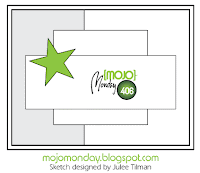
This sketch is today's Monday Mojo, and blanket was made using a technique from one of my quilter's books, which I have, but will probably never use for actual quilts.  I have to put a limit on my hobbies somewhere!

https://blogger.googleusercontent.com/img/b/R29vZ2xl/AVvXsEiQGhm_eLmOI5NdW-Ui88l3T7ffHGq2drSGWYO000VNd8JIz6KwcOOwav3Vc7RwFXxOvZLbk252fPb83yMHXZnI7n0mQlb_aEeh5asTo83-tjkkc2xOTbsKry7aTNYxlFaZzhKb86-inKDt/s1600/Mojo406.gif


Here's how to make the blanket: 
First, select your colors.  You can use pattern paper or Designer Paper, but I chose to use solids, and gave them texture by using a different embossing folder on each one.  Fine patterns work best. I used Night of Navy, Marina Mist, and Very Vanilla.


Because you will be working on the diagonal, your strips must be longer than the width of the blanket.  My blanket was to be about 3-1/8" x 3-7/8, so I made my strips 4-1/4 " long, although I could have made them even longer.  The strips are 5/8" wide.  I made 3 of each color.


Emboss all three strips at once to save time.


Now, cut a 4-1/4" x 5-1/2 piece of Very Vanilla card stock, and cover it with paste from a glue stick.  It is important to cover the whole card, because you will be working with lots of tiny squares of paper, and they will try to escape if they can!
Carefully line your strips on top of the Very Vanilla card stock.  Make sure  the 5-1/2" edges are perfectly straight; trim with scissors or a paper-cutter if needed.


Use your paper trimmer to slice across the stripes, to make these new multi-colored strips.  I used the same measurement of 5/8" to make my patches square.  If you want, you can get diamond shapes by just making the new strips a little wider or narrower than the first go-'round.   

Tip:  a rotary cutting blade will work better than a v-tip slicer, because you are cutting through two layers and all that embossing.  If you do use your v-tip slicer, you may need to go back and forth once to get a clean cut.


Here is what the strips look like when they're arranged diagonally & offset:


 This is the look that you're going for as you put your "blanket" together.
Now take another piece of Very Vanilla, this time cut to 4" x 3-1/4.  You may use your glue stick again, or if you prefer, Snail Tape or Fast Fuse.

Tip:  the glue stick will allow you to slide pieces over a bit if you don't lay them down perfectly right away.

Line up your strip diagonally across the Vanilla card so that the corners of the squares that hit the edge of the card match up pretty well.  You can see that both the corners of the Marina Mist square at the bottom and the Night of Navy square at the top line up to the edge of the card.  If your patches are diamond shaped, the angle will be a little different.
 
Line up the colors corner-to-corner across the "blanket."  Go in both directions from the first strip that you put down.  Notice that the strip furthest to the left is offset.  This is optional; it may or may not be convenient to do this to get the best coverage. 

 Turn the "blanket" over and carefully trim any strips that are sticking out past the edge.


 Here's what it will look like so far:
 Now, use the scraps to fill in any part of the design which still needs to be covered. 


Turn over and trim again.


Lastly, (looking at the front) you may want to trim the quilt using your paper trimmer so that the corners of the top and bottom rows meet nicely with the edge.  As you can see in the picture above, there is a little Vanilla sticking out between the blue blocks.  I trimmed the top and bottom, and then squared up the sides.


There's your quilt!

I layered mine on yet another piece of Very Vanilla (measure your final blanket after all that trimming to get the right size) before putting it on my card. 

The rest is a matter of using your blanket the way you want on your card.


Built for Free Using: My Stampin Blog


For some other fun card making blogs, try Mojo Monday,  Cardmania ChallengesScrapper's Delights, and Splitcoast Stampers