Tuesday, April 28, 2015

Happy Mother's Day!

(Details, Details!, My Favorite Mistakes and Monday Mojo, all rolled into one)

 Don't you love it when you can kill two birds with one stone?  I am combining several challenges AND a "Details" demonstration in one card here.  And a "Favorite Mistakes," too.  It makes me feel so efficient.

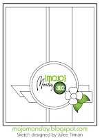
Monday Mojo #395--A really cute sketch this week.  (Do I say that every time I do one of these?) Even though I chose not to do the tall & skinny, I did enjoy this sketch, although I could immediately see that the little flag at the bottom right and I were not going to strike up an immediate friendship.  However, I did end up working it in, and like the result.  (Supplies list below.)


https://blogger.googleusercontent.com/img/b/R29vZ2xl/AVvXsEg78vsG2_mFBRAAX-6QF5lrdtGUG04Fos2ESMIehgPwTJpSHi0QGU53wXnNDShkGm8uwx3T-Cmrioauqm4MTWAf7488antmzzoY99LkFeAWzaXpNWCgTODYwq614Klfr2wZvdSo3pTQBtSJ/s1600/zzMojo395.gif
click here to play along


I knew I wanted to start with some spring flowers, and the little tulips from the Painted Blooms DSP were exactly what I wanted.  This is such a great paper set! The florals are backed by loose stripes, fun polka dots, or washed-solids.  Every time I look at it, I think what a fun wrapping paper it would make.

Painted Blooms DSP


As I worked on my card, I managed to slip with my punch and hang one of the scallops off the edge of the paper, resulting in a flat instead of a curve there at the top.  Lucky for me, I know several ways to deal with this, instead of balling up the punch-out and starting over (which is of course an acceptable solution, but I do like finding ways to fix all those little mess-ups, I do.)

The first way is to hang the flat scallop over the edge of the card, making it look like it was trimmed there on purpose. 


Here is the same idea, but the scallop was hung over the inner layer of DSP, leaving the card stock edge uncovered:


However, I wanted to place the scalloped circle more towards the center of the card; so I looked for a tulip of the appropriate color somewhere along the arc of where I wanted my edge to be, and simply used the flower to camouflage the missing bit of paper:


Pretty cool, huh?  You can't even see it from a normal distance.


So then I added my stamped greeting from the "Hello There" hostess set, which will be retiring at the end of May, 2015. 


This is a nice little layout, but I felt like adding a little more detail; so I layered the floral strip onto a piece of Soft Sky paper, which is the same as the card base.


I really liked it, but I did want it to be specifically a mother's day card, so I was able to incorporate the little flag after all:

This, of course, brings us to the final way to deal with that little scallop-shaving mistake.  Cover it up.  The most frequently used method to deal with card making, and also (so I hear,) political errors.
Happy Stamping!

Hello There Clear-Mount Stamp Set
Hello There stamp set--retiring soon

Supplies List--Purchase Here

Card Stock:
    Soft Sky, Marina Mist, Rose Red, Whisper White
Designer Paper:
    Painted Blooms
    In Colors 2014-16 Paper Stack (Hello Honey)
Ink:
    Blackberry Bliss, Marina Mist
Stamps:
  Hello There (hostess set, retiring soon!)            
    Teeny Tiny Wishes
Blackberry Bliss 3/8" Satin Stitched Ribbon by Stampin' Up!
Gorgeous Ribbon--ON SALE, retiring soon!
Punches:
    2" circle punch
    2 3/8" scallop circle punch
Accessories:
    Blackberry Bliss 3/8" satin stitched ribbon
    Glue Dots, Dimensionals, Snail Tape


Tuesday, April 21, 2015

Bloom With Hope


This is a beautiful set, with sketched flowers and sayings appropriate for both happy and sad occasions.  We never want to make sympathy cards, but when you need one, you want to make sure it is extra special.

Being a hostess set, Bloom With Hope is retiring at the end of this catalog year, and is only available to stampers who host a workshop which generates Stampin' Rewards.  Individual orders qualify as well.  Other retiring products are available on sale now, while supplies last.  Check them out here.


Using Basic Gray for the matting gives a softer look to the card.
Using Stazon black ink, stamp the flower first.  Use a sticky-note mask to cover it, and stamp the branch with the berries twice: once high, once low.  Stamp the plants high enough to leave room for the sentiment below, or low enough to place the sentiment above.


Having so many layers, (the insides are also double-matted with Gray and White or Black and White,) this card has a very nice feel to it.  There is something to be said for simple designs, but adding layers gives a feeling of luxury to a card.  If you don't want to add more colors, then tone-on-tone, or even white-on-white matting looks very
 elegant.


Supplies List:
Card stock:
Wisteria Wonder,
Basic Gray or
Basic Black,
Whisper White

Designer Series Paper:
Subtles Color Stack
(Wisteria Wonder, Pear Pizzazz*)

Stamps:
Bloom With Hope
Papillon Potpourri

Ink:
Stazon,
Stampin' Write Markers
(I used Old Olive, Pear Pizzazz, Wild Wasabi, Wisteria Wonder, Basic Gray, and several different shades of pink.)

Accessories:
Bitty Butterfly Punch
Snail Tape,
Pearl Jewels
Acrylic Blocks


*The current color stack pattern designs are a little different than those shown here; just pick your two favorite patterns!


Monday, April 20, 2015

Inspiration and Perspiration

Lost Lagoon 3/8" Silky Taffeta Ribbon

Having found another great deal in the Clearance Rack, namely the gorgeous Lost Lagoon 3/8" taffeta ribbon at 60% off, I went searching for some ideas for a card to use it on.  This lovely card by Penny Allen really caught my eye.


I was tempted to go into my "vintage" (read: "retired") paper stash to pair the Lost Lagoon with a lovely, soft green called Mellow Moss, (another great find on the Clearance Rack, years ago,) but decided to stay monochrome instead, just adding a little Night of Navy trim for a tiny bit of accent.

***UPDATE*** since posting this card, the Gifts of Kindness stamp set has peen put on the retired list. It is guaranteed only til May 26th, and then available as supplies last only til June 2nd.

Supplies:
Card Stock:  Lost Lagoon, Night of Navy, Whisper White
DSP Color Stack:  In Colors 2024-16, Lost Lagoon
Stamp Sets:  Gifts of Kindness, Papillon Potpourri
Punches:  Elegant Butterfly, Bitty Butterfly, Word Window
Ribbon:  Lost Lagoon 3/8" taffeta
Embellishment:  Pearl Jewels
And Don't Forget:  Snail Tape, Glue Dots & Dimensionals (for sticking on the butterflies, and making their wings "fly") and if you're getting clear mount stamps for the first time, you'll need the acrylic blocks.


Sunday, April 12, 2015

Mojo Monday #392


It's been several weeks since I got my Mojo going; not from lack of cute sketches, either. So finally, on Saturday night, I am getting around to posting my card.

http://www.mojomonday.blogspot.com/This is such a nice sketch--it can be done in so many ways.  You could easily see rotating it, changing the circle to another shape, adding extra layers or taking some away, and on and on; however, I ended up holding pretty exactly to what is drawn here.


I went to my stash of Gingham Garden DSP for this card.  This is an awesome paper collection.  You can't get it anymore; it was retired this year.  Just before it went away, it spent a little time on the Clearance Rack, and I went a little wild.  I was sad to see it go, but sure didn't mind stocking up for less than half of the regular price.  You've got to love the Clearance Rack.  I find it's a great place to shop when I can't sleep at night....


Right now, there are several great DSPs on clearance, including the beautiful "All is Calm" DSP, and several other Christmas papers.  I find that many of these papers are versatile enough to  use for lots of non-Christmassy themes.  Check them out here.


Monday, March 30, 2015

Classes and Events

If you live in the San Jose area and would like to learn how to make some wonderful cards, please check out my class schedule.  You can sign up on line, however the classes are all taught in person.

Even if you have never done anything crafty before, I promise you will have a great time and walk away with a sense of accomplishment and five beautiful cards, hand-made by YOU.  We explore different techniques such as texture embossing and heat embossing, paper piecing, sponging, coloring techniques, and more.  $20

I also have a regular schedule of drop in classes at the Cottage Crafts Boutique
14458 Union Avenue (In the Cambrian Park Plaza at Camden & Union Ave.) San Jose, Ca 95124.  You can find me there on the first, third, and if there is one, fifth Monday of each month.  
The cost is just $2 per card.     www.cottagecrafts.com/  


Wednesday, March 11, 2015

Mojo Monday

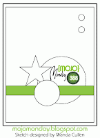
Mojo Monday challenge 388--a fun little sketch.  The star somehow made me think of "a tall ship, and a star to steer her by..." and then I left the star off of my card, 'cause that's how I roll.
https://blogger.googleusercontent.com/img/b/R29vZ2xl/AVvXsEhZ2CZuIdVgxnLeOHaNQyk2h3SU9KeXR8mJoRDoKjNgs3gaT1ZoBORQjKr6lHsHyaU3IkS3zj4N6Fet8_JjNZcoq1oa-GZYYC3-yg-fUAK5fSrGY8HUqIdcrUikRb3pGFOfnMc1yS1k0nGF/s1600/mojo388.gif
 I love this saying, from the Adventure Awaits stamp set.  The whole set is very 50s deco, and lots of fun.  This is perhaps not the best way to highlight a stamp that wants to be done in juke-box colors, but I like the overall card.  The ship is from "The Open Sea."

Here is a Clean-and-Simple version, no sentiment. 
 I loved the lonely look to this, but I kind of felt that it wanted a couple of seagulls.  So I put them in, and immediately regretted making them so big and so stark.  Should've used my gray marker, and a much less curvy wing, to make them look more real against the cloudy sky.

I should probably file this under "mistakes that bug the card maker and are hardly noticed by anyone else," but I know that this is such an egregious error, that you can't possibly overlook it.  Can you?


Supplies list: (shop here)
Stamp Sets:  Adventure Awaits, The Open Sea
Card Stock:  Whisper White, Smokey Slate, Basic Gray, Soft Sky, Lost Lagoon
Ink:  Memento for the stamps; Soft Sky, Lost Lagoon, Smokey Slate, Basic Gray for spongeing.
Accessories:  Scallop Border Edge Punch and a Basic Grey marker for your optional seagulls.  
All the Usual:  Snail tape, dimensionals (for the top card only) sponges (for the bottom cards only.)

Hints and Tips:
On the bottom card, tear a strip of Soft Sky card stock, and only sponge the torn edge very lightly to get the look of foamy brine.  This section is sponged in Soft Sky and Lost Lagoon.
The sky is sponged in Smokey Slate and Basic Grey, with a touch of Lost Lagoon to make the sky look stormier.  When doing the sky, go lightly--try not to saturate your sponge. Wipe of excess ink on scrap paper before rubbing on your card, to get a mistier look.  Try a combination of stippling (patting) and rubbing.
  
Oh, and make your seagulls smaller than mine.


Playing With Color Palettes

I found a gorgeous card on line made with retired stamps and ribbons, so I decided to update it.

But before you look at the card, look at the color palette:
Daffodil Delight, Bermuda Bay, Old Olive, Calypso Coral        So Saffron, Coastal Cabana, Pear Pizzazz, Crisp Cantaloupe

Two variations of the same colors, one more saturated than the other. 
I started with the Blended Bloom image on Whisper white Cardstock, and punched out each quarterof the image with my postage stamp punch. I colored each quarter with a different set of colors, as listed above.  To get this effect, use either your Blendabilities (if you were lucky enough to get a set,) or use your ink pads and aqua painters, or markers and blender pens. 


I cut two sets of squares using my 1 3/8" punch, one in the darker palette, one in the lighter, just to compare.  To me, the darker squares in coral and teal brought out the shadows in the flowers, making it appear almost like a water lily half submerged, whereas the lighter squares made the flowers look more bright. 

I found the opposite effect in the yellow and green.  Strange.  I was thinking that I liked the darker palette better, when it occurred to me that I was not restricted to either or!! It's my card, after all.  


I ended up choosing the darker shades for the warm colors, and the lighter shades for the cool. 


The final result?
Ink pads:  Daffodil Delight, Coastal Cabana, Pear Pizzazz, and Calypso Coral  (Stazon for the image.)
Paper:  Whisper White, then Pear Pizzazz, Calypso Coral 
Stamps:  Blended Bloom, Crazy About You
Ribbon:  Sale-a-Bration Coastal Cabana 1/4" ribbon
Punches:  Large Oval Punch, Scallop Oval Punch
Shop Here